You’ve seen them. Competition boards where the architecture is exceptional and the renders don’t land. Competition boards where the architecture is forgettable and the renders sell the submission. And, rarely, competition boards where the image and the project reinforce each other, and the jury stops scrolling.
Over the past three years, our studio has made the winning imagery for three international architecture competitions: A-FACT’s Park of Arts and Culture in Podgorica, MVRDV’s Busan Waterfront, and A-FACT’s Bertalia district in Bologna. In every case, there were more technically accomplished studios submitting. In every case, there were bigger names on the jury’s shortlist. And in every case, the images made a material difference.
This piece is what we learned from those three projects about the difference between a render that looks good and a render that wins.
The mistake most architects make
The most common mistake we see, and we see it often, is starting from the brief.
The competition brief tells you which views to produce. “Aerial shot from the northeast. Street-level view of the main entrance. Interior view of the public atrium.” Follow the brief, produce the views, submit the boards.
That approach treats the image as an output. Something the competition requires. A deliverable to tick off.
The problem with that approach is that every other submitting team is also starting from the brief. Every other submission will have the aerial view, the street-level view, the atrium view. They will all be technically competent. They will all be photorealistic. And the jury will glance at most of them, because nothing about those views required the jury to pause.
The image that wins isn’t the one that follows the brief. It’s the one that argues for the project in a way the plans and sections can’t.
What the jury actually sees
Imagine yourself on the jury. You have twenty minutes per submission. You have seventy submissions to review. You are tired. You’ve seen the same compositional shortcuts a hundred times by lunch.
What makes you stop?
In our experience, it’s almost always the same thing: a view that reveals something about the project the plans couldn’t tell you. The angle that shows the scale. The time of day that shows the atmosphere. The framing that implies the program. A person doing something in the foreground that tells you what the building is for.
The winning image is almost never the most photorealistic one. It’s the one with a point of view.
“The winning image isn’t the most photorealistic. It’s the one with a point of view.”
Case in point: Podgorica
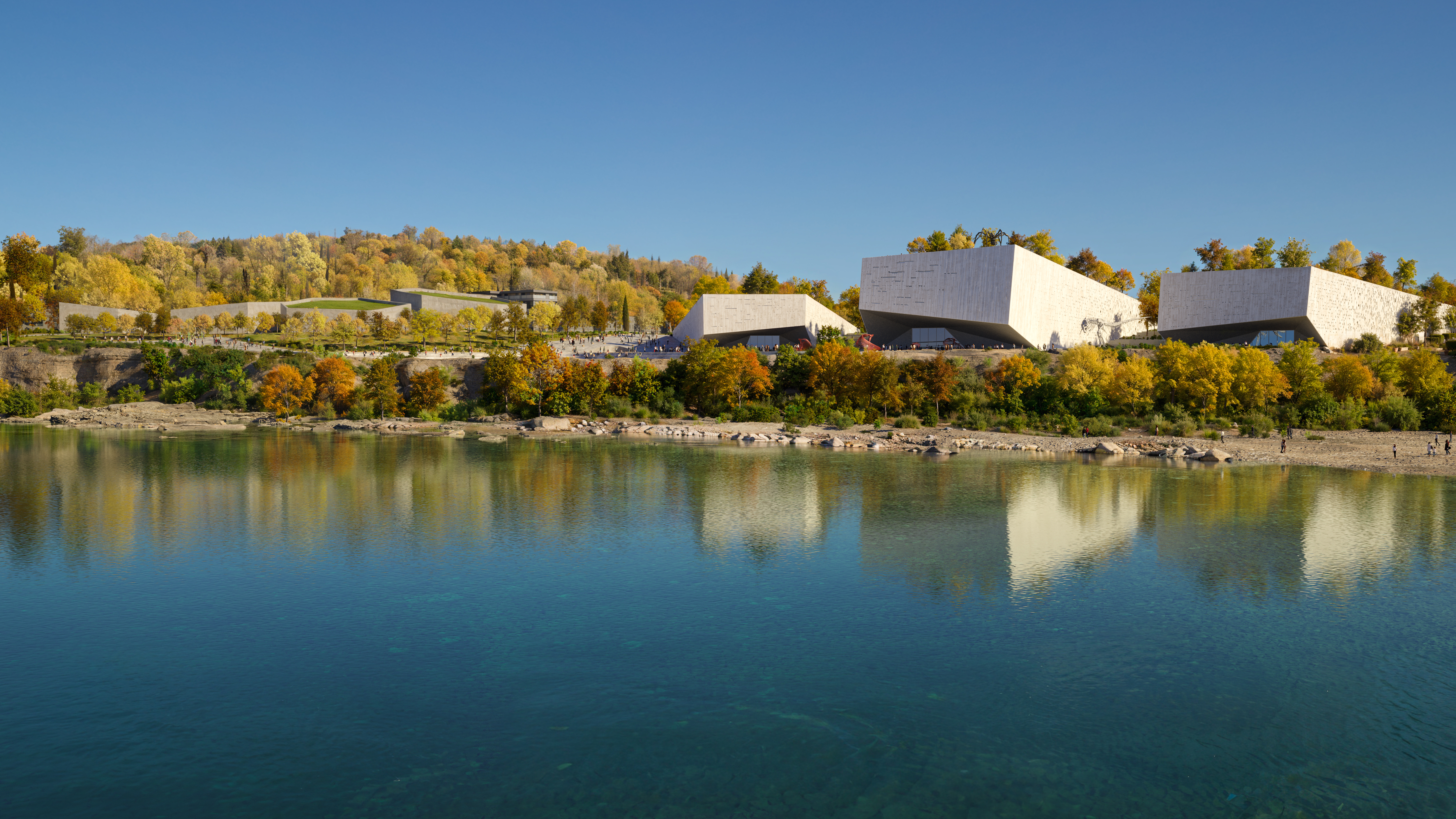
When A-FACT sent us the Podgorica project, a park of arts and culture with three museum buildings on the Moraça River, the brief specified a mandatory aerial view.
We looked at the brief. Then we looked at the project. Then we told A-FACT we weren’t going to make the mandatory aerial.
It wasn’t defiance. The project had a specific quality: three stone-clad buildings emerging organically from the riverbank, with green roofs and terraces blending into the landscape. The mandatory aerial the brief described (“city, surroundings, road network”) would have shown all of that from a distance that flattened everything. A generic urban-planning shot. The kind of aerial every other submission would also include.
We proposed a different aerial instead. Higher, tighter, rotated. Three buildings visible in plan, reading as origami forms emerging from the green. The river in the foreground, the city receding behind. The composition didn’t follow the brief’s requirements, but it argued for the project in a way no other view could.
A-FACT took the bet. The submission won. The image ended up selected for the Inbetweeness 2024 exhibition, printed large and installed on the wall. Giovanni Sanna, one of A-FACT’s partners, told us later: “Our renders were better than Snøhetta’s, better than Annie Larson’s.” He wasn’t being casual. He’d seen the competitors’ submissions.
The lesson: sometimes the brief-breaking view is the winning view.
Case in point: Busan
MVRDV’s Busan Waterfront Gateway Tower was a different problem. 50,000 square meters. A mixed-use skyscraper reconnecting the city to its historic fish market. The scale was the subject.
A common mistake with skyscrapers is to render them the way most skyscrapers get rendered: isolated, hero-shot, clean sky, a few trees at the base, one or two people to suggest activity. The building stands alone. It feels like a product shot.
But a skyscraper that isolates from its context tells the jury the wrong story. It says “look at this object.” What the project needed was the opposite: look at this city, and here is what this tower does for it.
So we rendered from water level. The camera sat on the harbor, looking back at the city. The tower occupied the left third of the frame. The existing fish market and the urban fabric occupied the rest. The tower didn’t stand alone. It stood in relation to everything around it. The aerial views we produced alongside it showed the same relational logic: not the tower as object, but the tower as the city’s new gateway from the sea.
MVRDV won the competition. The project is now under construction.
Case in point: Bertalia
Bertalia was the hardest of the three. A social housing district in Bologna. No iconic form. No dramatic site. A competent mixed-use scheme that, by A-FACT’s own admission, wasn’t “wow” architecture. They described it to us as “social housing, simple, even banal.”
This is where most competition renders fail. When the project has nothing architecturally spectacular to sell, the instinct is to over-render: add dramatic sunset lighting, saturate the colors, populate the scene with a hundred people. The result is always the same: the image feels like it’s trying too hard, and the jury sees through it.
The approach we took on Bertalia was the opposite. We underplayed the image. Softer light. Quiet atmosphere. Pedestrians doing unremarkable pedestrian things: walking a dog, sitting with a coffee, cycling past. The material palette was legible, the proportions were honest, and the neighborhood looked like a place someone would actually want to live in.
The image didn’t try to convince the jury the project was spectacular. It convinced the jury the project was credible. Bertalia won the competition. A-FACT won their second major project with us. The lesson from Bertalia was the one we didn’t want to learn: the less your project needs dressing up, the less you should dress it up.
The five questions to ask before the camera is placed
After three competition wins, these are the questions we start every competition project with, before we open the 3D software:
- Who is on the jury, and what do they respond to? A competition jury of academics responds differently than a jury of practitioners. Research the panel before you compose the first view.
- What is the project trying to say that the plans can’t? This is the question the mandatory brief views won’t answer for you. The answer is where the winning image lives.
- Which three views would we produce if the brief said “one aerial, two free”? The brief’s free views are usually the ones you should protect. The mandatory views are the ones most teams will over-produce.
- What is the one compositional choice nobody else will make? Low camera where everyone else goes high. Wide when everyone else goes tight. Morning when everyone else does sunset. Difference is a competitive advantage.
- What does the image make the viewer feel in the first two seconds? If the answer is “it looks expensive,” you’ve made the wrong image. If the answer is “I want to be there” or “this project matters,” you’ve made the right one.
One last thing: the render isn’t the project
Competition renders can win a project that deserves to win. They can also win a project that doesn’t. That second case is the one we turn down.
Our studio works on competitions because we believe the image is part of the project, not dressing up for it. If the project isn’t there, we’ll tell you in the first call. If the project is there, we’ll compose the images that make the jury see what you see.
Three international wins in three years isn’t a trend. It’s a process. We read the project first, then we compose the image. The brief comes last.